UI / UX
Salute Case Study
Creating digital products that provide meaningful and relevant experiences to your users. UX should be efficient and fun.
Salute - Meet, Greet and Share for a Cause
Introduction
Salute is a cross-platform tool for social good and is meant to make an impact. The app and the accompanying responsive website is designed to help first-generation immigrants find local causes and activities they identify with to participate as volunteers and help them integrate. First-generation immigrants in the Netherlands come from diverse cultures. They are is in most cases very different from the Dutch and western European cultures. They usually find it hard to understand and fully integrate into their host country’s culture. They have also left all their social network behind in their home country and struggle to make new friends in their new country to expand their social network. Salute is there to help them find new friends and create a new support network in the Netherlands by taking part in events and activities as volunteers.
Problem
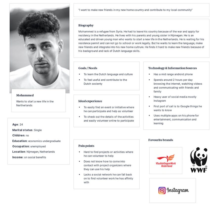
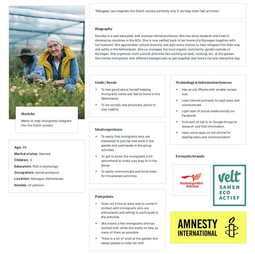
Based on the pain points of our personas below
we distinguished the following problem statements:
Mohammad is a Refugee in the Netherlands waiting for his permit who has spare time and needs to practice his Dutch language and make new friends to expand his social network because he wants to integrate into the Dutch society.
Marieke is a retired professor
who needs to find volunteers to help and participate in multi-cultural activities because she wants to get to know immigrants from different cultures and get some work done.
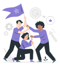
Project Goals
The goal of Salute is to provide the target audience with a platform where the two user groups can find and come into contact with each other based on criterias like location, skills, type of activities, etc. Next to the functionalities of the app the website is to provide information about the initiative, inspire people to donate and create awareness and trust for the platform.
My Role
In this project I took ownership of the platform design from concept to delivery, together with other members of my team. My responsibilities in the project included: UX research, persona's, user journey mapping, ideation, information architectute (IA), wireframing, prototyping, usability studies, iterations and creation of the final hi-fidelity mock up and prototype.
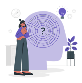
Key Challenges
The primary challenge was how to design for target audience immigrants with such a diverse cultural and socio-economic background. Another challenge was how to make best use of the real estate on the small size mobile phones. Initial studies showed the users mostly use an older phone with smaller sizes.
Process
Research
Interviews
Questions
Key findings
Ideation
Brainstorming
Low-fidality wireframes
User flow
Design
Colors
Typography
Visual elements
Prototypes
Testing
Feedback
Things to consider
Final
Design
Iterations
Lessons learned
Initial Concepts and Design Strategy
To help us make some design decisions we exercised the Crazy 8 technique to quickly generate some ideas about the design. Here is an image of our Crazy 8 initial ideas:

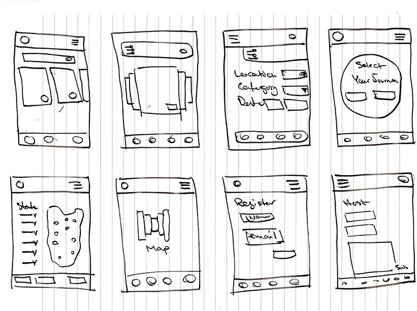
Wireframes
Based on the Crazy 8 sketches and what we learned from the users during the emphasize phase we came up with multiple ideas for the design. Then we created the digital wireframes you will find below:
Usability Study
We put our initial prototype into a usability test. Below you will find the details of our usability study:
Methodology: unmoderated
Location: the Netherlands, remote via Zoom application (each participant will complete the study at his/her own place) Participants: they will be from two target groups: First-generation immigrants in the Netherlands and Dutch volunteers hosting activities and events for immigrants
2 males and 2 females between the age of 18 to 70.
1 male and 1 female with some form of disabilities.
The study will be accessible for use with a screen reader and a switch device.
Usability Insights
Collecting and evaluating the research findings we could spot the following insights:
- Based on the theme that: most users wanted to see their past activities, an insight is: an overview of the volunteers’ past activities should be made available in the app.
- Based on the theme that: most users preferred to sign up with their Gmail account, an insight is: it should be possible for the users to sign up with their existing Gmail accounts.
- Based on the theme that: most users were not sure what happens next if they apply for an activity, an insight is: after the application they should get feedback on what happens next.
- Based on the theme that: most users were unsure what they should fill in the required fields for adding an activity, a insight is: users need some examples what they could possibly fill in the fields.
- Based on the theme that: a lot of users were wondering if they can rate or review the activities, an insight is: that a rating systems should be made available for the users.
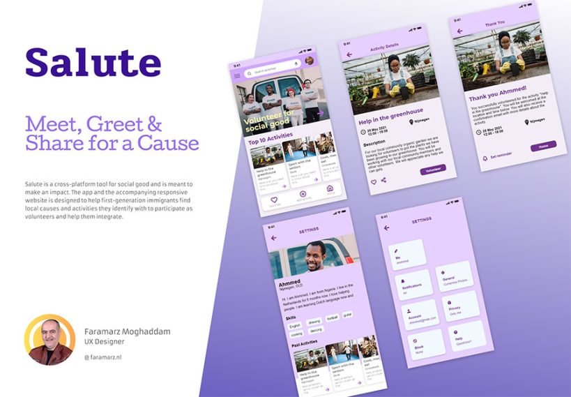
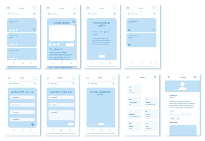
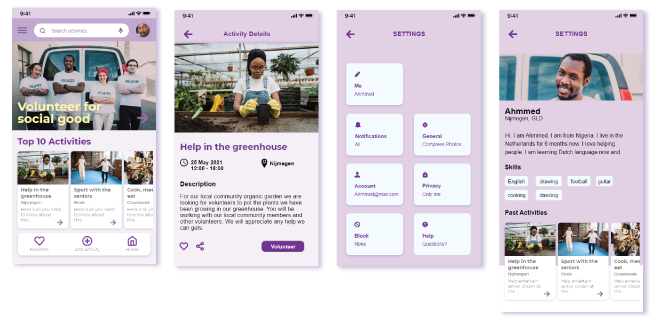
High fidelity Prototype
After prioritizing the insights we decided we needed to implement the following iterations in the design:
- An overview of the volunteers’ past activities should be made available in the app
- After user applications they should get feedback on what happens next
- Users need some hints as to what they could fill in the form fields for hosting an activity
Below you will find some screenshots of the final design:
Accessibility Considerations
From our primary research we realized that a majority of the users use an older smartphone with smaller screen. Based on that we designed the app for smaller screen. This will make sure that the menu items and text stays readable. In the app we also added tooltips to the navigation bar at the bottom of the screen. We also made interactive elements larger for older users.
The text and call to action buttons also have sufficient contrast, so that visually impaired users will not miss them
Leasons Learned
In the process of the app’s design I realized the primary users come from diverse background and cultures. The visual cues needed to be universal and made sense for both the Dutch hosts with Western European cultures and the immigrant volunteers from practically all over the world.